
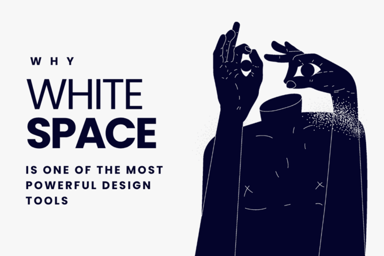
Every time someone views your website, social media graphics, or marketing materials, their eyes need room to breathe. One of the most underestimated elements that shapes how people feel about your design is white space.
What Is White Space?
White space—also called negative space—is the empty area around and between design elements. It includes:
- The space around your logo
- Margins around text and sections
- Line spacing and paragraph gaps
- Padding inside buttons or containers
- Gaps between images, icons, and graphics
- Layout breathing room around key visuals
White space isn’t “empty.” It’s an intentional part of the design that helps guide focus and improve clarity.
Why White Space Elevates Design
When used correctly, white space makes your design feel clean, modern, and premium. It helps your audience understand what matters most and reduces visual stress.
Here’s why it matters:
- Improves readability: Text becomes easier to scan and absorb.
- Creates a premium look: Luxury brands use white space to appear refined and confident.
- Increases focus: It directs the viewer’s attention to important elements.
- Reduces overwhelm: A spacious layout feels calmer and more organized.
Where White Space Often Goes Wrong
Many businesses accidentally overcrowd designs. Common mistakes include:
- Filling every corner with text or graphics
- Using tight margins and cramped layouts
- Adding unnecessary decorative elements
- Not leaving breathing room around images or headlines
- Trying to fit too much information in one design
These issues make your visuals feel heavy, confusing, or low-quality.
How hbd | Branding Agency Designs With Purposeful White Space
We design layouts that feel balanced, modern, and visually calm through intentional spacing. Our approach includes:
- Creating clean, structured layout systems
- Using spacing scales for consistency
- Designing visual hierarchy that guides the eye
- Removing clutter and unnecessary elements
- Building templates that prioritize clarity and breathing room
From website layouts to social media graphics, the right amount of space can completely transform your brand’s presence.
White space isn’t empty—it’s functional. It’s a strategic design choice that strengthens your message, improves user experience, and elevates your brand instantly.
If your designs feel crowded or visually overwhelming, white space is the solution.
Ready for designs that feel clean, modern, and high-end?
Let’s create visuals that breathe and communicate with clarity.